Today I started creating the final version of my album magazine advert.


Talking to my partner and my teacher about what type of picture we should go with and what the picture should look like has given me more of direction for my partner and I's advert. In our discussion we looked at different example of digipaks and adverts that our similar to the ideas my partner and I have for our advert.
These are some of the examples we looked at:
This image shows the text aspects of the advert. Including: Band name and title, body copy and an action line.

Here I added a picture to the advert, to see if a large image like this one would work well behind the text or whether a smaller picture would work better.


These are some of the examples we looked at:
| We liked this one because the colours used showed the bands style and gave a British Social Realism look to the picture. |
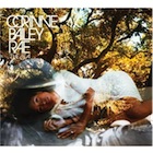 |
| Front cover of Corinne Bailey Rae's album 'The Sea' |
We liked Corinne Bailey Rae's album cover and feel we could use a similar look in our album magazine advert as when the audience looks at the album it kind of leave the question 'where does the picture of the artist finish and the picture of the location start?' As my partner and I are connecting our artist closely to natural locations, e.g. forests, we think it would be a good to use a similar picture to Corinne Bailey Rae's album picture to help show this connection.
No comments:
Post a Comment